
Styles of Abstract Art
Abstract art took a number of different forms, across a number of European countries and then the U.S. from about 1901 until the outbreak of World War II - some lasting for short periods, with others being more enduring. Abstract art endures today as a general art form. The more well known styles from the Modernist period which are included in this program are:

Benedetta Cappa, Speeding Motorboat, 1923
Futurism 1909 - 1944
 Giacomo Balla, Dynamism of a Dog on a Leash, 1912Balla takes the kind of subject that Impressionism had specialised in, a street scene with bourgeois promenaders, but he picks out only a single detail, an almost randomly chosen clip, and makes it the focus of the whole picture. We get a ground-level perspective, the dog's view of the world. We get the human world reduced, cut off at the knee. Their legs have multiple positions, indicating brisk walking. |  Carlo Carrá, The Red Horseman, 1913Carrá met Umberto Boccioni and Luigi Russolo, and together they came to know Filippo Tommaso Marinetti and to write their Manifesto. He initially used the technique of Divisionalism despite the radical rhetoric of Futurism until he saw Cubist works in 1911. Carrà’s disillusionment with Futurist aims and his intensifying rivalry with Boccioni became apparent from 1915 in paintings that concentrated on the human figure. |  Lyubov Popova, Air + Man + Space, 1912 |
|---|---|---|
 Umberto Boccioni The City Rises 1910Buildings in construction in a suburb can be seen with chimneys in the upper part, but the most of the space is occupied by men and horses, melted together in a dynamic effort.[1] Boccioni thus emphasizes some among the most typical elements of futurism, the exaltation of human work and the importance of the modern town, built around modern necessities. The painting portrays the construction of a new city, with developments and technology. |
"A roaring car that seems to run on machine-gun fire is more beautiful than the Victory of Samothrace. ... We stand on the last promontory of the centuries! ... Why should we look back, when what we want is to break down the mysterious doors of the Impossible? Time and Space died yesterday. We already live in the absolute, because we have created eternal, omnipresent speed. ... We will glorify war — the world’s only hygiene — militarism, patriotism, the destructive gesture of freedom-bringers, beautiful ideas worth dying for, and scorn of woman. ... We will destroy the museums, libraries, academies of every kind, will fight moralism, feminism, every opportunistic or utilitarian cowardice. ... Come on! Set fire to the library shelves! Turn aside the canals to flood the museums! ... Oh, the joy of seeing the glorious old canvases bobbing adrift on those waters, discoloured and shredded! ... Take up your pickaxes, your axes and hammers and wreck, wreck the venerable cities, pitilessly!"
So declaired Italian poet and writer Filippo Tommaso Marinetti 1876-1944 the Futurist Manifesto in 1909. He also declared that "Art [...] can be nothing but violence, cruelty, and injustice."
The Manifesto, which was published on the front page of the French newspaper Le Figaro on 20 February 1909, laid out the principles of his movement, which embraced art, architecture, literature, poetry, craft, theatre, sound and music. It highlighted 11 main points, all of which railed against the art of the past. Futurists wanted to demolish museums and libraries and all the art of past centuries, claiming that to glorify war was 'the only cure for the world'.
Futurism also embraced danger, aggression and new technology, and accentuated a love of speeding cars and aeroplanes. Further manifestos followed, such as the ‘Manifesto of Futurist Painters', circulated in Marinetti's publication Poesia in 1910. Addressed 'To the Young Artists of Italy', it asked followers to reject the art of Italy's ancient and Renaissance past, and to see the country not as a vast Pompeii of ancient history but as a new country, reborn.
Alongside Marinetti, who was born in Egypt, the leading members of the radical group, all Italians, were painter and sculptor Umberto Boccioni (1882-1916), painter Carlo Carrá (1881-1966), painter and composer Luigi Russolo (1885-1947) and painter Gino Severini (1883-1966). Art and literature focused on modernity and speed, notably in Boccioni's painting The City Rises, which captures the dynamism of the city.
The widening Futurist group included young architects rejecting classicism and all forms of past architecture to create modern buildings. Antonio Sant’Elia (1888-1916), a key member, is noted for his visionary insight of future architecture. His ideals were cut short by his early death in 1916.
In artistic style, the Futurists took the sharp geometric shapes of Cubism for their own canvases, concentrating not on still lifes and portraits, but instead on scenes such as crowds in city centres and cars and trains in flux.
They extenuated a sense of rhythm and movement by using more varied marks and colour contrasts than the Cubists, and Giacomo Balla also studied photographic sequences of people in motion for this purpose.

The Futurists wanted their art to have a visceral effect, the dynamism of their subject matter translating directly into the viewer's experience: they declared that their 'lines of force must envelop the spectator and carry him away'.Marinetti and others in the group agitated for Italy to join the First World War. However, the conflict eventually took the wind out of the movement's sails: new machines didn't seem so attractive once they had been used in what the Cubist Fernand Leger called "the perfect orchestration of killing". Futurism's finest moments had already passed and it continued only in a less transgressive, more lyrical vein until the end of the 1920s. Although many members of the group moved on to other ventures after the war, Futurism remained a visible art form until the beginning of World War II.

Duchamp had seen photographs by Eadweard Muybridge, which influenced this early Futurist artwork.

Eadweard Muybridge, Man descending stairs, from Animal Locomotion, 1887
Marcel Duchamp, Nude Descending a Staircase, No. 2, 1912
Natalia Goncharova, Cyclist, 1913
Cyclist is often regarded as one of the archetypal works of Futurist painting, both in Natalia Goncharova’s oeuvre as a whole and the Russian art of the early 1910s in general.
It embodies such typical features of Futurism as constant repetition, dislocation of the contours of the figure, which seems to be recorded in temporal and spatial sequence, and the interspersion of fragments of street signs, in order to convey the bustle, noise and movement of the city.
The composition of the painting is, however, horizontally and vertically balanced and carefully regulated,which distinguishes it from the classical works of Futurism.


Italian artist Boccioni, who sought to infuse art with dynamism and energy, exclaimed, "Let us fling open the figure and let it incorporate within itself whatever may surround it". The contours of this marching figure appear to be carved by the forces of wind and speed as it forges ahead. While its wind–swept silhouette is evocative of an ancient statue, the polished metal alludes to the sleek modern machinery beloved by Boccioni and other Futurist artists.
Umberto Boccioni, Unique Forms of Continuity in Space, 1913


Using photography, collage, drawing or painting, create a machine that shows rapid movement.
Orphism 1912 - 1914
 Sonia DelauneyRhythm, 1938 |  Jacques VillonCrucifixion, 1961 |  Frantisek KupkaStudy for Around a Point, 1925 |
|---|---|---|
 Fernand Léger,Constrast ofForms,1913Léger argued for the independence of painting from its traditional role of representation and proposed instead that it should attain the greatest possible dissonance and “intensity” by means of contrasting shapes and colours. The amplified effect of contrast would create in painting an “equivalent” to the experience of modern life. Here, the juxtaposition of dark hues and bright highlights and the impression of movement. |
Writer Apollinaire described Orphism (or Orphic Cubism) as “the art of painting new structures with elements that have not been borrowed from the visual sphere, but have been created entirely by the artist himself, and been endowed by him with fullness of reality. The works of the Orphic artist must simultaneously give a pure aesthetic pleasure, a structure which is self-evident, and a sublime meaning, that is, a subject. This is pure art.” (Les Peintres Cubists, 1913)
Apollinaire drew a connection between the colourful, cubist-like canvases, and the mythological figure, Orpheus, who symbolises the art of song and lyre. The Greek legend describes Orpheus as the ideal, mystically inspired artist.
The reference to Orpheus, the singer and poet of Greek mythology, reflected the desire of the artists involved to bring a new element of lyricism and colour into the austere intellectual Cubism of Picasso, Braque, and Gris. The correlation between colour and music was an idea that interested many artists at the time. Symbolist artists and writers saw analogies between musical tones and visual hues and Wassily Kandinsky had associated music with the abstract aspects of his art, and he discussed the connections in his book, Concerning the Spiritual in Art, in 1912.
Orphism was also inspired by writings about colour theory by Michel-Eugène Chevreul, a nineteenth-century French dye chemist.
More concerned with the expression and significance of sensation, this movement retained recognisable subjects but was absorbed by increasingly abstract structures. At its simplest, Orphism infused the monochromic tones of Cubism with a saturation of colour, so that the object remained secondary to it.
The Orphists were led by Robert and Sonia Delaunay and Jaques Villon. Other Orphists included Fernand Leger, Francis Picabia, Marcel Duchamp and his brother Raymond Duchamp-Villon. The Delaunays were immersed in the use of pure colour, Robert in painting, Sonia in painting, textiles and theatrical costumes.
Robert and Sonia Delaunay's experimentation with colour prisms, fragmented in their Simultaneous Contrasts and Solar Disc series, was central to their theories on colour and form, producing abstract compositions. Robert Delaunay's Eiffel Tower paintings introduced a fourth dimension: time. Fernand Leger promoted Orphism through an alternative visual sensation, utilising line and colour. In his series Contrast of Forms (1913) the volumetric tubular, square and cylindrical shapes represent the human form in semiabstract depictions. Orphism spread throughout Europe, notably in Russia, where, under the label Rayonism and influenced by Robert Delaunay, Natalia Goncharova (1881-1962) developed her own vision.
Orphism as a movement was short-lived, essentially coming to an end before World War I but was an important stepping-stone from Cubism to pure Abstraction.

Michel-Eugène Chevreul developed his colour theory on the basis of knowledge gained while working beginning in 1824 as director of dyes for a company that produced elegant tapestries, the Royal Manufacturers at Gobelins. Chevreul analysed complaints lodged by customers who were displeased with the tapestries they purchased. Joen Wolfrom, author of "The Magical Effects of Color," states that Chevreul came to the conclusion that troublesome colour interactions were to blame for the bulk of these complaints. Thus, Chevreul attempted to identify abiding principles that could help him and others to avoid making unpleasant color combinations.
Theories
Optical illusions are sometimes created when bold colours are placed in close proximity to one another, creating pronounced differences between each colour. This effect, described by Chevreul, is called simultaneous contrast. Simultaneous contrast may create an optical illusion that appears to lighten or darken the hue of a given colour depending on whether it is placed beside a second coloor that is darker or lighter in hue.
Chevreul also advanced the concept of optical mixing, which explains the manner by which two individual colours blend together to suggest a third colour. An example of optical mixing occurs when the two primary colours red and yellow are overlayed upon one another, appearing to create the secondary colour orange.
See Section on Colour Theory
Robert Delauney - Eiffel Tower Series
As it was for many literary and artistic figures of the day, the Eiffel Tower, built for the Exposition Universelle de Paris of 1889, became a symbol of modernity for Robert Delaunay. Delaunay chose a subject that allowed him to indulge his preference for a sense of vast space, atmosphere, and light, while evoking a sign of modernity and progress. Delaunay’s achievements in style represent a new century and its shift toward urbanization.
Delaunay envisioned breaking down boundaries and transforming Europe into a global community, and the Eiffel Tower, in its capacity as a radio tower, embodied international communications. He first painted the tower in celebration of his engagement to fellow artist Sonia Terk in 1909 and would make it the subject of at least thirty works over the next few years and again in the 1920s.
Delaunay’s early treatments of the Eiffel Tower use a limited palette and simple blocklike forms. Centrally located within each of the compositions, the Eiffel Tower assumes the iconic drama of a portrait.
The more dynamic representation of Eiffel Tower with Trees (the fouth image below) signals a shift in the artist’s style. Delaunay showed the tower from several viewpoints, capturing and synthesizing several impressions at once. It is significant that this painting was executed when he was away from Paris, working from memory. Eiffel Tower with Trees marks the beginning of Delaunay’s self-described “destructive” phase: the solid form in his earlier works becomes fragmented and begins to crumble.

Robert Delaunay, Windows Open Simultaneously 1st Part 3rd Motive, 1912
You can see in the middle row below how Delauney has melded cubism with brighter colours. The tower has been fragmented and is just recognisable as a tower. These works can be described as Orphic. These are delicate, lyical compositions of softly geometric colour patches that retain hints of the tower and of other buildings.
The later works, painted in the 20s, see a return to a recognisable tower, using a brighter bolder palette.


Strong
Cubist
influence, with great expression
Less recognisable
structure and softer palette
Later
Works
(1920's)
Suggested Videos
http://www.moma.org/explore/multimedia/videos/264/1394
KunstmuseumWthurEN Robert Delaunay, The Window Giving over the Town, 1912


Can you create a orphic artwork which provides "pure aesthetic pleasure, a structure which is self-evident, and a sublime meaning, that is, a subject"?
Suprematism 1915 - c. 1930
 Olga Rozanova, Suprematist Composition c. 1916.PNG |  Olga Rozanova, Non-Objective Composition (Suprematism)In 1918 Malevich called her the "only true Suprematist". However, she created paintings in which colour shapes cluster & overlap in extraordinary profusion. They relate in depth as well as on the surface, unavoidably taking up space and even interlocking at times. Colours are not imposed, or reduced, like those of Malevich, but seem to derive from a sense of the world as it is, in keeping with Rozanova's belief that "Figurative art has been born of a love of colour". |  Kazimir Malevich Red Square 1915Malevich was the eldest of 14 children born to Polish parents in Kiev in 1879, when Tsar Nicholas II ruled Russia. Eighty per cent of the population were classed as serfs. Red Square may be decisively abstract but it is subtitled Painterly Realism of a Peasant Woman in Two Dimensions, and there is no mistaking the life force conveyed in that advancing form, nor the free spirit, no matter that the woman isn't shown. |
|---|---|---|
 Liubov Popova, Painterly Architectonics, 1917Futurism, Suprematism, the reliefs of Tatlin, and even Renaissance art and the Orientalism of Samarkand into her work. These disparate sources informed Popova's unique resolutions of form and color, crystallized in the dynamic reliefs and architectonic paintings of the late 1910s, such as Painterly Architectonics, 1917. |  El Lissitzky, A Proun, 1925Under the guidance of Malevich, helped further develop the movement. He used colour and basic shapes to make strong political statements. Lissitzky also challenged conventions concerning art, and his Proun series of two-dimensional Suprematist paintings sought to combine architecture and three-dimensional space with traditional, albeit abstract, two-dimensional imagery. His influence in the world of graphic design cannot be overstated. |  Aleksandra Ekster Blue, Black, Red 1917Ekster was a suprematist and constructivist painter as well as a major influencer of the Art Deco movement. she was one of the most experimental women of the avant-garde. Her works are vibrant, playful, dramatic, and theatrical in composition, subject matter, and colour. She worked with Vadym Meller as a costume designer in a Ballet Studio of the dancer Bronislava Nijinska (Vaslav Nijinsky's sister). in 1924 see moved to Paris where she taught with Fernand Léger. |
 El Lissitzky, Beat the with with the Red Wedge, 1919In the poster, the intrusive red wedge symbolises the Bolsheviks, who are penetrating and defeating their opponents, the White movement, during the Russian Civil War. The image of the red wedge shattering the white form, simple as it was, communicated a powerful message that left no doubt in the viewer's mind of its intention. |  Marlow Moss, White and Yellow, 1935Her work from the period following her discovery of Mondrian shows his influence, but it was Moss who first introduced twin lines into her gridded compositions in 1931. A year later, Mondrian followed suit, painting Composition with Double Line and Yellow. |
Suprematism was a form of abstract art developed by Russian writer and painter Kasimir Malevich, which flourished from 1915. Malevich lived and worked through one of the most turbulent periods in twentieth century history. Having grown up in Tsarist Russia, Malevich witnessed the First World War and the October Revolution first-hand.
Malevich worked in a variety of styles, but his most important and famous works concentrated on the exploration of pure geometric forms (squares, triangles, and circles) and their relationships to each other and within the pictorial space. Equally important to him was the sue of colour, and its supremacy in painting. He used only a limited palette, which created a strong focus in his works. In Suprematist painting colour and form are one and the same thing. Colour and shape are of equal importance and one can't exist without the other.
Like other artists of his time, Malevich believed that the external world should no longer serve as the basis for art, which should instead explore pure, non-objective abstraction. He regarded Suprematism as primarily an exploration of visual language comparable to contemporary developments in writing.
Because the proportions of objects in painting generally corresponded with the proportions objects in nature through the use of perspective etc, he proposed a style of art that rejected the conventions of composition which provide clues to the viewer about the artwork and how to interpret it. He argued that art should be purely aesthetic and concerned only with form, free from any political or social meaning.
Malevich also argued that non-representational pictures could provide 'pure feeling'. In 1915, he wrote in his manifesto Ot kubizma i futurizma k suprematizmu: Novyy zhivopisnyy realizm (From Cubism and Futurism to Suprematism: the New Realism in Painting). “Nothing is real except sensation . . . the sensation of non-objectivity”.
Whilst many Cubist and Futurist works had stripped down pictorial space to arrangements of geometric shapes and intersecting lines from about 1909 onwards, Malevich took this approach to the extreme, stressing the purity of shape, particularly of the square, as this is a shape that doesn't exist in nature. (Consider the advice of Cezanne, who also stressed the use of geometric shapes in his painting - ('treat nature by the cylinder, the sphere, the cone'. He didn't use, or advocate the use of, squares. )
 |
|---|
 |
 |
 |
 |
 |
 |
 |
 |
 |
 |
 |
Malevich traced the origins of Suprematism to his designs for sets and costumes for the Russian Futurist opera Pobeda nad solntsem (Victory over the Sun), in St Petersburg in December 1913.
The opera exemplified the collaboration of poets and painters that was a key feature of Russian Futurism at the time.
Malevich’s costumes were stiff constructions, and some of the backdrops employed Cubist motifs which were reinterpreted to incorporate Futurism. One backdrop, however, consisted of a simple square divided diagonally into black and white areas surrounded by a rudimentary framing motif.
Subsequently, Malevich reduced art forms to a minimum using just a small number of simple geometric shapes in solid colours.
He first showed his Suprematist works at 0.10 The Last Futurist Exhibition in St. Petersburg in December 1915 (at the same time he published his manifesto). It was at this time that he exhibited Black Square, which stood for his Suprematist theory on art.
Black Square, 1915 (it began as a sketch in 193) was simply a large black square of paint on a canvas, surrounded by a margin of white. Malevich declared: 'Black Square is the face of the new art. The Square is a living, royal infant. It is the first step in a pure creation of art.' The square symbolized sensation, and the background represented nothingness.
Other formally austere works by Malevich painted in 1915 featured other strongly coloured squares and rectangles, and a black circle or a blue triangle intersecting with a black square.
Malevich and other Suprematists also emphasised the surface texture of the paint on canvas as being an essential quality of the medium of painting.
 |
|---|
 |
 |
 |
 |
 |
 |
 |
 |
 |
 |

Kasimir Malevich, White on White, 1918
(click to link to MoMA)
By 1916–17 he was presenting more complex shapes (fragments of circles, tiny triangles); extending his colour range to include brown, pink, and mauve; increasing the complexity of spatial relationships; and introducing the illusion of the three-dimensional into his painting. His experiments culminated in the “White on White” paintings of 1917–18, in which colour was eliminated, and the faintly outlined square barely emerged from its background. Around 1918, Malevich began to reinterpret Suprematism, seeing its stages as vehicles of states of consciousness. By 1920, he announced the death of easel painting, and in 1922, the end of Suprematism. However, his followers continued to practise this style into the 1930s.
While Suprematism began before the Revolution of 1917, its influence, and the influence of Malevich’s radical approach to art, was pervasive in the early Soviet period.
Other Suprematist artists included El Lissitsky, Olga Rozanova, Liubov Popova and Aleksandra Ekster. Both El Lissitsky and Kandisky (who admired the style) advocated this form of art in Germany, including at the Bauhaus.
Suggested Videos
Black Square: Malevich and the Origin of Suprematism YIVO Institute for Jewish Research
https://www.youtube.com/watch?v=muwA6UlNza0
The challenge for this activity is to really pare back your project (perhaps either a painting or collage) to create a pure sensation. Look at using only one or two colours with a very simple square or triangular geometric design.
How difficult is it to create interest using such a inimalist approach? Does it 'work' for you as piece of art?
Constructivism 1919 - c. 1940
 El Lissitzky, Designs for a Future |  Alexander Rodchenko, The Critic, Osip, 1924 |  Lyubov Popova, Constructivism design |
|---|---|---|
 Alexander Rodchenko , Construction no 92This is a strong example of his use of form, using clearly constructed paintings, probably using a rule to mark out the lines. |  Liubov Popova, Constuction Space-Strength, 1921Liubov Popova, Constuction Space-Strength, 1921This lithograph, and one also made with the colours reversed, reflect Popova's view of the city | 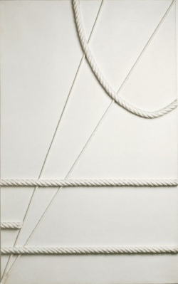 Marlow Moss, White with Curved Cord, 1943Moss lived and worked between Paris and Cornwall, changing her name and permanently adopting a masculine appearance in 1919. |
Russian Constructivism developed in response to the October Revolution of 1917 and evolved just as the Bolsheviks came to power.
Initially it acted as a lightning rod for the hopes and ideas of many of the most advanced Russian artists who supported the revolution's goals. It borrowed ideas from Cubism, Suprematism and Futurism, but at its heart was an entirely new approach to making objects, one which sought to abolish the traditional artistic concern with composition, and replace it with 'construction', that is, practical design work.
The term was first coined by artists in Russia in early 1921 and achieved wide international currency in the 1920s.
At its core, it was first and foremost the expression of a conviction that the artist enhances the physical and intellectual needs of the whole of society by entering directly into a rapport with machine production, with architectural engineering and with the graphic and photographic means of communication. Constructivists wanted to socialise art, rather than politicise it.
Constructivism is typically characterised by the use of industrial materials—such as glass, plastic, and standard metal parts—arranged in clear formal relationships. Key features of Constructivism was that it should be utilitarian, flexible, and temporary.
Constructivism called for a careful technical analysis of modern materials, and it was

hoped that this investigation would eventually yield ideas that could be put to use in mass production, serving the ends of a modern, Communist society. Ultimately, however, the movement foundered in trying to make the transition from the artist's studio to the factory.A result of Constructivism was the creation in 1918 of a state-run school of design, later known as Vkhutemas (the abbreviation for Higher Art and Technical Workshops), which trained artist and designers - the artist Liubov Popova, for example, taught textile design there. It was similar to the workshops of the Bauhaus (1919-33).
Constructivist paintings were designed to look as it they had been constructed - that is, having the look and feel of a manufactured object.
Russian Constructivism was in decline by the mid 1920s, partly a victim of the Bolshevik regime's increasing hostility to avant-garde art. But it would continue to be an inspiration for artists in the West, sustaining a movement called International Constructivism which flourished in Germany in the 1920s, and whose legacy endured into the 1950s. Constructivist artists included Vladimir Tatlin, Kasimir Malevich, Alexandra Exter, Robert Adams, and El Lissitzky.
.
Vladimir Tatlin - Monument to the 3rd International
Vladimir Tatlin (1885-1953), a Russian artist, designer and a co-founder of the Constructivist movement, studied at the Moscow School of Painting.
Tatlin visited Paris in 1914, making abstract Relief Constructions using materials such as sheet metal, wood, and wire. He was influenced by the sculptural experiments of Picasso, who had used a variety of ingeniously assembled odds and ends in his assemblages, and perhaps also by the 1913 Futurist sculptural manifesto in which Boccioni similarly advocated a move away from the traditional techniques of modelling and carving in favour of sculpture that was constructed from various new materials.
He practised constructional sculpture from 1913 on, making abstract works in wood, metal and glass. His constructions dating from 1915-16 were free-form suspensions. Tatlin is remarkable for his unbuilt project - Monument to the 3rd International (1919-20) - a vast construction to be engineered from iron and steel, wood and glass, and intended when built to be taller than the Eiffel Tower, its spirals adding a dynamism to the metal frame.

Monument to the Third International, 1919-20 model

Monument to the Third International, 1919-20

Monument to the Third International, 1919-20, model in London
Monument to the Third International, 1919-20 model
Although never built, this 400 metre-high tower of glass and steel spanning the Neva was to rise in a slope of two latticed spirals in which four geometrical volumes were meant to be superimposed (a cube, a pyramid, a hemisphere and a cylinder) rotating on their own axis. On 8 November, 1920, the anniversary of the Revolution, Tatlin exhibited a five-metre high model in his ‘space, materials and construction workshop’ in Petrograd.
This utopian design, so typical for the frenzied mood of Russians in the years immediately following the Bolshevik revolution was, in theory, to have been taller than that great symbol of modernity, the Eiffel Tower. Its spiraling structure, however, was to lend the Monument a structural dynamism lacking in Eiffel's more symmetrical (and more stable) design. In theory, the Monument was to house a telegraph office, and other office space, but Tatlin, who was no architect, did not even attempt to work out the engineering problems that would have had to be overcome. Instead, like so many other early Soviet projects of utopian intent, Tatlin's tower (as it came to be called) never went past the planning stages.The Revolution created a ferment of enthusiasm in Russia for the building of a better society, with machinery seen as a liberating force, and in this climate Tatlin's idea of investigating and exploiting industrial materials came into its own.
From his reliefs Tatlin went on to develop small openwork structures (sometimes hanging).
Perceived as the outcome of Tatlin’s spatial experiments which began in 1913 and his first Counter-Reliefs, the Monument was also the prototype for many examples of monumental architecture of propaganda commissioned by the Bolsheviks to glorify the Revolution.
Alexander Rodchenko
In 1917 Rodchencko began making three-dimensional constructions under the influence of his friend Tatlin, and some of these developed into graceful hanging sculptures. Like Tatlin and other Constructivists, Rodchenko came to reject pure art (‘The art of the future will not be the cosy decoration of family homes'), as he committed to the values of the Revolution.
Rodchenko’s research into the concept of line was fundamental to the ambitions of Russian constructivism. Careful examination of his paintings and objects from 1918 to 1921 show both the experimentalism and the hesitations that accompanied his move from construction to production art.
Some time around the middle of 1920 he produced a remarkable work consisting of a zig-zag white line painted on a black background. The painting’s monochrome background lacks any texture, but creates a depth behind the zig-zag, which therefore comes to lie in, or on, the picture surface.
Construction No. 126 (see right) appears to embody a kind of technical standard, since quite visibly the lines have been painted in oil paint against one edge of a piece of card or flexible wood, perhaps a wooden ruler. Simple inspection of the painting can tell us that two of its three lines are slightly bent towards one end. source: Tate Museum

Rodchenko abandoned painting in 1921 and devoted his energies to industrial design, typography, film and stage design, propaganda posters, and photography. (He resumed painting in his later years.)
Although Rodchenko and other Constructivists aimed to collaborate with industry, their lack of practical training and the crippled state of Russian factories conspired largely to frustrate this goal. But Rodchenko was also eager to address a broad public through the mass media, and in the field of graphic design his work flourished.
In 1921, faced with food shortages and famine, Lenin announced the new Economic Policy (nEP), allowing private enterprise to operate on a limited scale. while agricultural and industrial production slowly recovered, many Bolsheviks saw the policy as a compromise with capitalism.
Rodchenko responded to these new circumstances by going into partnership with the futurist poet Vladimir Mayakovsky as experts on advertising. He also worked with his wife Varvara Stepanova and Liubov Popova. Their work not only introduced modern design into Russian advertising, but it attempted to sell the values of the Revolution along with the products being promoted. Their clients included the state-run industries who now faced competition from the private sector, and they designed posters or packaging for products such as cigarettes, bread, sweets and biscuits. Against those who condemned advertising as irredeemably capitalist, Mayakovsky argued that ‘it is necessary to employ all the weapons used by our enemies’. In rejecting passivity, the aim was to transform the submissive viewer into an active observer.
Even amid the compromises of nEP, such projects retained a sense of urgency and dynamism, and the critical approach to the visual that was one of the ideological hallmarks of Constructivism.
Photomontage and Photography

Lily Brick, 1924

Photomontage, 1934

Orchestra, White Sea Canal, 1933
Lily Brick, 1924
Photography was important to Rodchenko in the 1920s in his attempt to find new media more appropriate to his goal of serving the revolution. He first viewed it as a source of pre-existing imagery, using it in montages of pictures and text, but later he began to take pictures himself and evolved an aesthetic of unconventional angles, abruptly cropped compositions, and stark contrasts of light and shadow. His work in both photomontage and photography ultimately made an important contribution to European photography in the 1920s.
His photography was socially engaged, formally innovative, and opposed to a painterly aesthetic. Concerned with the need for analytical-documentary photo series, he often shot his subjects from odd angles—usually high above or below—to shock the viewer and to postpone recognition. He wrote: “One has to take several different shots of a subject, from different points of view and in different situations, as if one examined it in the round rather than looked through the same key-hole again and again.”
From 1923 to 1928 Rodchenko collaborated closely with Mayakovsky (of whom he took several striking portraits) on the design and layout of the publications of Constructivist artists. Many of his photographs appeared in or were used as covers for these journals. His images eliminated unnecessary detail, emphasized dynamic diagonal composition, and were concerned with the placement and movement of objects in space.
Throughout the 1920s Rodchenko’s work was very abstract. In the 1930s, with the changing Party guidelines governing artistic practice, he concentrated on sports photography and images of parades and other choreographed movements.
Advertising Posters


, Advertising poster for Battleship Potemkin

Advertising Poster for the State Airline Dobrolet, 1923
Throughout the 1920s, Rodchenko completed numerous commissions for book covers, posters and Party propaganda images, including the film poster design for Sergei Eisenstein’s epic ‘Battleship Potemkin.’
By often featuring bright primary colours, aggressive geometric shapes and repeated bold lettering, Rodchenko successfully underpinned the stark dynamism of the Soviet regime.
Rodchenko used a ruler to draw lines and applied paint to canvas mechanically, so that nothing of his personality should find its way into the things he created.
He used very few simple colour techniques, usually with no more than 3-4 block colours on a typical poster. He also used bold block lettering that integrated with the design.
Liubov Popova
Liubov (also spelt Lyubova) Popova was influenced by Vladimir Tatlin and worked in his studio for some time between 1912 and 1915. Inspired by his constructions, Popova experimented with collage and in 1915 began to produce painted reliefs in which projecting curved elements made of cardboard are juxtaposed and enlivened with strongly coloured, impasto paintwork (e.g. Jug on a Table, 1915 (see right at top)).
In 1916 she produced her first non-objective canvases, six of which she exhibited as Painterly Architectonics. Her development as an artist was encouraged through private lessons and frequent travel, which brought her into contact with a broad range of historical artworks, from Italian Renaissance art and Russian medieval icons to Cubism and other Western avant-guarde styles. In 1912 she moved to Paris with fellow painter Nadezhda Udaltsova to study painting at the Académie de la Palette. There she mastered the Cubist idiom and was probably exposed to Italian Futurism; the two styles that would dominate her paintings of the next three and a half years. (see Lyubov Air + Man + Space, 1912, centre right.)
In 1923 Popova began creating designs for fabric to be manufactured by the First State Textile Printing Works in Moscow (see right below). Her engagement with design in general and textile design was the culmination of extensive thought and activity, including her determination to use her artistic skills, not to create works of art as such, but to participate in the construction of the new Communist environment by using those skills to design new everyday objects for mass production.
In 1921 she stated that "The era that humanity has entered is an era of industrial development and therefore the organisation of artistic elements must be applied to the design of the material elements of everyday life, i.e. to industry or to so-called production.
The new industrial production, in which artistic creativity must participate, will differ radically from the traditional aesthetic approach to the object, in that primarily attention will be focused not on the artistic decoration of the object (applied art), but on the artistic organisation of the object in accordance with the principles of creating the most utilitarian object …".
Both her paintings and textiles reveal Popova’s commitment to analysing the nature of form by exploring permutations of a single idea and pursuing such explorations in a series of works, whether canvases, gouaches, drawings or fabric designs. Ever since she had started experimenting with cubism in 1914–15, Popova had worked in series, analysing her approach and producing variations of a single image. She emphasised that she was exploring ‘the organisation of elements … as self-contained structures’ and investigating ‘the significance of each element – line, plane, volume, colour.’
source: Tate Museum


Suggested Videos and Reading
http://www.tate.org.uk/context-comment/video/constructivism-and-art-everyday-life-video-recordings
Andrew Graham-Dixon guide of exhibition by Rodchenko and Popova at the Tate (3 videos)

Constructivism is typically characterised by the use of industrial materials—such as glass, plastic, and standard metal parts—arranged in clear formal relationships. Key features of Constructivism was that it should be utilitarian, flexible, and temporary.
Either create, draw or paint an object which meets the Contructivism manifesto. Consider perhaps a household item for your inspiration.
De Stijl (The Style) - Neo Plasticism 1917 - 1932
"We speak of concrete and not abstract painting because nothing is more concrete, more real than a line, a colour, a surface."
Theo van Doesburg
 Marlow Moss White, Yellow and Black, 1953There has been some debate about the close relationship between Moss's work and that of Piet Mondrian, whom she met in 1929. Both developed compositions using double lines to divide space. But Moss's interest in precise calculation and structure (carried out with compass and ruler) pre-dated her knowledge of Mondrian's methods. She had studied mathematics and architecture intensively at the British Library. |  Theo van Doesburg Simultaneous Composition 1929-30.PNG |  Theo van Doesburg Composition VII (The Three Graces), 1917.PNG |
|---|---|---|
 Gerrit Rietveld Red Blue Chair 1923Hoping that much of his furniture would eventually be mass-produced rather than handcrafted, Rietveld aimed for simplicity in construction. The pieces of wood that comprise the Red Blue Chair are in the standard timber sizes readily available at the time. |  Theo_van_Doesburg_Counter-CompositionV_(1924).jpg |  Jean Gorin, Composition Plastique, 1964 |
De Stijl, meaning simply The Style, sought to blur the lines dividing art, craft and design.
Founded in 1917 by Theo van Doesburg and supported strongly by Piet Mondrian, the Dutch publication De Stijl came to represent the common aims and utopian vision of a loose affiliation of both Dutch and international artists and architects.
Like the Suprematists and Constructivists, many of the artists of De Stijl - which Mondrian described as Neo-Plasticism, meaning a "new plastic art', were committed to the idea of abstract art having a purpose beyond mere decoration. Art, they felt, could create a new society which rejected individuality and embraced a collective will. This would lead to spiritual harmony which could produce peace and positivity in a European society blighted by suffering.
They wanted to create a style appropriate for every aspect of contemporary life, one so coherent, so intelligible, and so complete that the distinctions between art and life would eventually be erased when everything produced by human agencies, from teacups to town plans, would participate in a universal visual and intellectual harmony.
Intending their work to look impersonal and machinelike, De Stijl artists based their work on the fundamental principles of geometry. Key was the use of straight lines, squares and rectangles, combined with strong asymmetry. They advocated the predominant use of pure primary colours together with black and white. The composition of an artwork should stress the relationship between positive and negative elements through the use of non-objective forms, geometric shapes and lines.
Even though De Stijl artists created work embodying the movement's utopian vision, their realisation that this vision was unattainable in the real world essentially brought about the group's demise. (Van Doesburg continued the publication De Stijl until 1932.)
Ultimately, De Stijl's continuing fame is largely the result of the enduring achievement of its best-known member, Piet Mondrian, even though he withdrew from De Stijl in 1923 following Van Doesburg’s adoption of diagonal elements in his work. Other artists affiliated with De Stijl include Vilmos Huszár, Bart van der Leck, and Georges Vantongerloo, as well as the architects Gerrit Rietveld and JJP Oud.

Victory Boogie-Woogie is the last, unfinished, work by Mondrian. The diamond-shaped painting was covered with pieces of colored paper and plastic which Mondrian new accents and rhythms was investigating. If he would have had time, he would probably have been replaced by a painted cubes. In this diamond-shaped painting the rectangular planes and surfaces in the colours white, grey, blue (dark and light) , red and yello , and their complex interrelationships are decisive. see Gemeentemuseum

Based on the aesthetics of the Hague School, and the realism of the Barbizon School, considered at the time in the Netherlands to be the very model of modern art, Piet Mondrian explored light and space through landscapes. He also explored pointillism, inherited from Signac, fauvism, expressionism, inspired by Munch's art, and geometric Synthetism.

In this painting, his penultimate, Mondrian replaced the black grid that had long governed his canvases with predominantly yellow lines that intersect at points marked by squares of blue and red. These atomized bands of stuttering chromatic pulses, interrupted by light gray, create paths across the canvas suggesting the city's grid, the movement of traffic, and blinking electric lights, as well as the rhythms of jazz.
Victory Boogie-Woogie is the last, unfinished, work by Mondrian. The diamond-shaped painting was covered with pieces of colored paper and plastic which Mondrian new accents and rhythms was investigating. If he would have had time, he would probably have been replaced by a painted cubes. In this diamond-shaped painting the rectangular planes and surfaces in the colours white, grey, blue (dark and light) , red and yello , and their complex interrelationships are decisive. see Gemeentemuseum
By the early 1920s, in line with De Stijl practice, he restricted his compositions to predominantly off-white grounds divided by black horizontal and vertical lines that often framed subsidiary blocks of individual primary colours. Although his works may look simple, he took great pains to achieve a dynamic balance in his work.
Mondrian escaped to New York from Europe after the outbreak of World War II and was delighted in the city's architecture. He was also fascinated by American jazz, particularly boogie-woogie, finding its syncopated beat, irreverent approach to melody, and improvisational aesthetic akin to what he called, in his own work, the "destruction of natural appearance; and construction through continuous opposition of pure means—dynamic rhythm." His style modified again at this time, as he sought to add music to his work, by using bands of work with a strong use of yellow.
In this painting, his penultimate, Mondrian replaced the black grid that had long governed his canvases with predominantly yellow lines that intersect at points marked by squares of blue and red. These atomized bands of stuttering chromatic pulses, interrupted by light gray, create paths across the canvas suggesting the city's grid, the movement of traffic, and blinking electric lights, as well as the rhythms of jazz.
His use of asymmetrical balance and a simplified pictorial vocabulary were crucial in the development of modern art, and his iconic abstract works remain influential in design and familiar in popular culture to this day.
Suggested Videos & Reading
Piet Mondrian: Mister Boogie Woogie Man
https://www.youtube.com/watch?v=RAjVj1ZeTJg&feature=youtube_gdata


Create an artwork using geometric shapes and lines and a palette of no more than four colours. Think about how the shapes and lines interrelate to make an interesting composition.
How does your choice of colour support the composition as a whole?
Mondrian is recognized for the purity of his abstractions the and methodical practice by which he arrived at them. He radically simplified the elements of his paintings to reflect what he saw as the spiritual order underlying the visible world.
From 1913 his work evolved into purely abstract art using black horizontal and vertical lines. In 1914 he wrote "I construct lines and color combinations on a flat surface, in order to express general beauty with the utmost awareness. Nature (or, that which I see) inspires me, puts me, as with any painter, in an emotional state so that an urge comes about to make something, but I want to come as close as possible to the truth and abstract everything from that, until I reach the foundation (still just an external foundation!) of things…"
By 1917 his lines had become so ordered that they formed right angle grids on the canvas. The spaces in the grids were painted in colours and black.